In the world of print marketing, understanding rack card sizes is like knowing the right key for a lock. It’s a simple yet essential piece of knowledge. Whether you’re promoting a business, event, or service, the size of your rack card can greatly influence its impact.
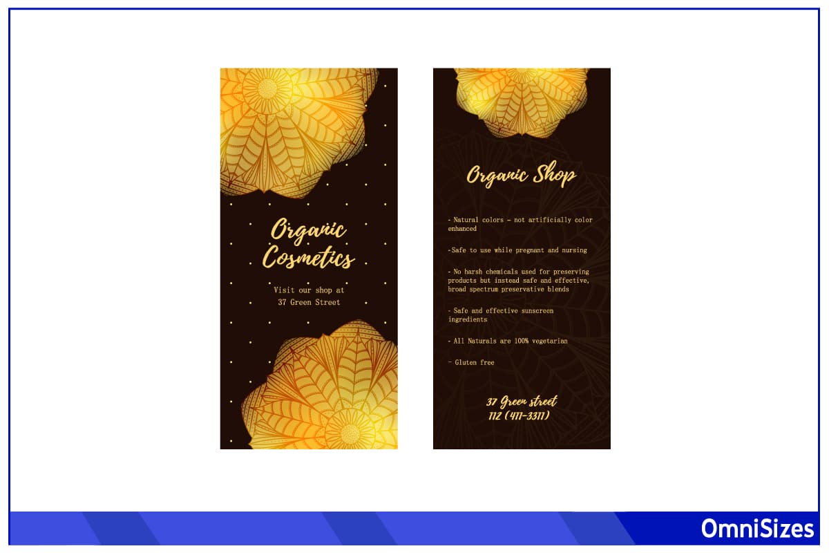
Standard rack card sizes typically measure 4 × 9 inches (10 × 23 centimeters) and 3.5 × 8.5 inches (9 × 22 cm). The choice of size is significant as it affects how much information you can present and how your message is perceived.
This guide will dive into various rack card sizes, their uses, and how to choose the right one for your needs.
Standard Rack Card Sizes
Rack cards are a go-to for savvy marketers and business owners. They’re like mini billboards, perfect for grabbing attention in busy places. But size matters here–getting it right is key to making your rack card pop.
The popular sizes on the block are 4 × 9 inches and 3.5 × 8.5 inches. These sizes fit snugly in standard display racks found in tourist centers, hotels, and stores. They’re big enough to be eye-catching but small enough to be handy.
Since they’re the norm, most print shops are set up to churn these out efficiently, saving you time and money. Plus, they’re super easy to find cases and holders for.
Custom Rack Card Sizes and When to Use Them
Stepping outside the standard sizes can give your rack cards a unique edge. Custom sizes allow you to tailor your marketing material to specific needs and stand out in a sea of traditional designs.
Exploring Non-Standard Sizes
Custom sizes for rack cards can range anywhere from tiny to pretty large. You could go for a slim and tall card (3 × 9 inches), a square one (4 × 4 inches), or even something that folds out (8 × 9 inches unfolded). This flexibility lets you be creative and specific in your approach. Think of these as the “choose your own adventure” in the rack card world.
Ideal Scenarios for Custom Sizes
Custom sizes shine in certain scenarios. If you’re aiming to stand out at a crowded event, a unique size can be a game-changer. They’re also great when you have more information to share than a standard card can handle, or when you’re targeting a high-end audience and want to exude luxury and exclusivity.
Choosing the Right Size for Your Audience

Selecting the perfect rack card helps you connect with your audience effectively. The size of your rack card can speak volumes before a word is even read.
1. Understanding Your Audience
First things first, who are you talking to? Different groups respond to different sizes. A younger, more dynamic crowd might appreciate a quirky, unusual size, while a more traditional audience might prefer the familiarity of standard sizes. Consider the demographics, preferences, and expectations of your target audience.
2. Content Volume and Audience Engagement
How much do you have to say? More content calls for more space. However, too much text on a small card can be overwhelming. Likewise, too little content on a large card can look sparse and unengaging. Match your content volume with a size that allows for comfortable reading and visual appeal.
3. Distribution Locations and Size Relevance
Where will your rack cards be displayed? Busy tourist spots might mean your card needs to be compact and easy to grab. In a boutique hotel, a larger, more luxurious card might be more appropriate. Consider the context in which your audience will encounter your card.
4. Event-Specific Sizes
If you’re distributing rack cards at specific events, like trade shows or festivals, tailor the size to the event. A larger size might stand out at a trade show, but a smaller, pocket-sized card might be better for a festival where people don’t want to carry much.
5. Analyzing Competitors’ Sizes
Look at what sizes your competitors are using. Is there a standard in your industry? Standing out might mean choosing a different size, or it could mean sticking to a tried-and-tested format but doing it better.
Design Tips for Different Rack Card Sizes
When it comes to rack cards, size isn’t the only thing that counts. How you design for each size can make a big difference in catching someone’s eye and getting your message across.
1. Designing for Standard Sizes (4 × 9 inches and 3.5 × 8.5 inches)
These sizes are versatile and familiar. For these, keep your design clean and focused. Use bold headlines and large, eye-catching images.
2. Maximizing Small Sizes (Smaller than 3.5 × 8.5 inches)
Small rack cards are great for quick, snappy messages. For these, simplicity is your best friend. Use vibrant colors and catchy, concise wording. Images should be simple and powerful. With less room for text, every word needs to pack a punch.
3. Utilizing Large Formats (Larger than 4 × 9 inches)
Bigger rack cards are your canvas for storytelling. They give you room to include more detailed information, like event schedules, product descriptions, or detailed maps. Use headings and bullet points to organize your content. Balance text with visuals to keep it engaging but not cluttered.
4. Typography Tips
Your choice of font can make or break your design. Use a maximum of 2 or 3 font types to keep things cohesive. Make sure your main message stands out. For smaller text, clarity is key. Make sure it’s easy to read at a glance.
5. Color Schemes and Branding
Colors can set the mood and highlight your brand. Stick to your brand colors for consistency. If you don’t have brand colors, choose a palette that reflects the mood of your message–bright and bold for excitement, soft and subtle for sophistication.
6. Adding a Call to Action
No matter the size, your rack card should always have a clear call to action. This could be a website, a phone number, or a simple message like “Visit us!” Consider using a different color or a special design element.
