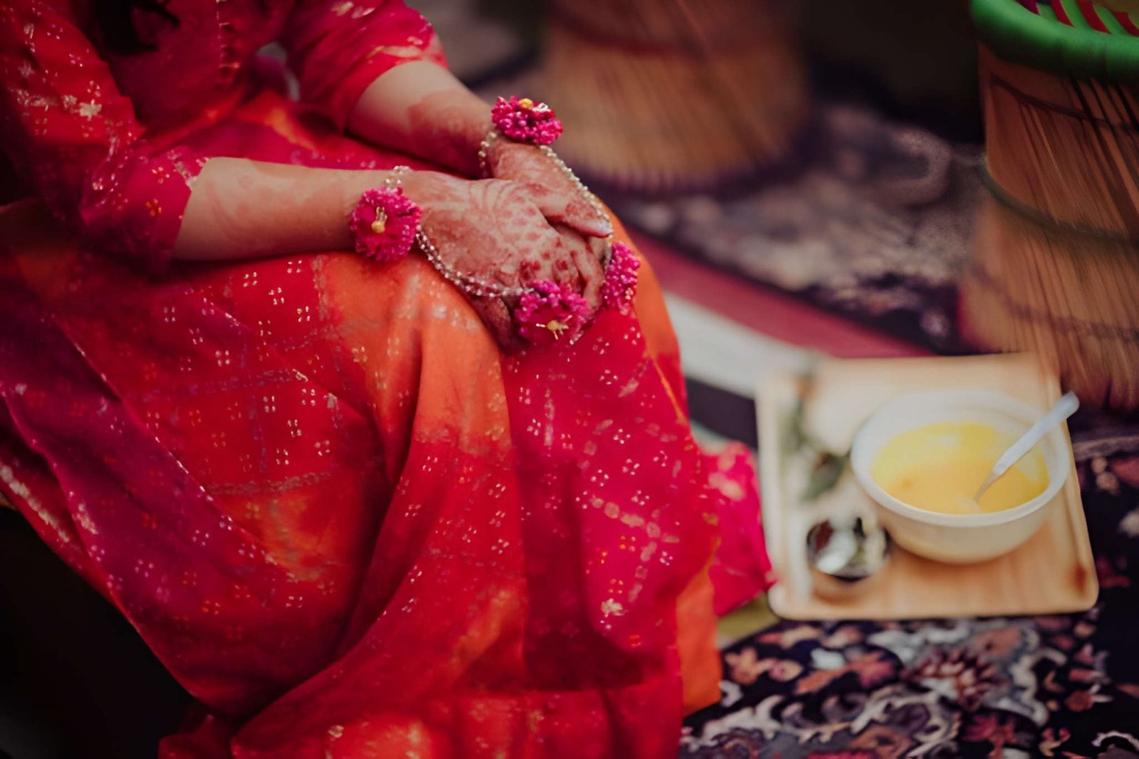
In a ceremony, colours do more than decorate the space; they shape its overall charm. A thoughtfully selected colour palette can make the setting look brighter, more cohesive and effortlessly elegant, helping every decorative detail come together more appealingly.
What Makes a Mehndi Colour Scheme Look Elegant
An elegant mehndi setup is not about using many colours, but choosing the right combination. The shades should feel festive and lively while still looking balanced. Softer pairings, earthy tones, and warm hues often work better than too many bright colours together.
The wall styling, florals, seating, drapes, and outfit should look well coordinated. A refined palette helps every element stand out without making the décor feel loud or crowded.
Trending Colour Palette Ideas for a Mehndi Ceremony
These colour palette ideas can help create a Mehndi décor setup that feels festive, elegant, and visually well-balanced.
Earthy Green and Beige
This combination feels fresh, calm, and tasteful. Green naturally suits a mehndi function because it reflects freshness and tradition, while beige softens the overall appearance. It works especially well for intimate home functions where you want the décor to feel elegant rather than overly decorative.
Mustard and Ivory
Mustard brings festive warmth, while ivory adds a cleaner and more polished finish. Together, they create a bright setting without making the space look too busy. This pairing is ideal when you want a daytime celebration to look cheerful but still refined.
Coral and Peach
For a softer festive mood, coral and peach can work beautifully. These shades bring warmth and vibrancy, but they do so in a gentler way than louder wedding colours. This palette suits families looking for a modern mehndi setup with a graceful visual appeal.
Terracotta and Cream
Terracotta adds depth and richness, while cream keeps the décor light. This pairing feels mature and stylish, making it a strong choice for a more polished celebration. It also complements wooden décor, cane accents, and floral styling very naturally.
Pink and Olive Green
This combination gives a traditional function a slightly updated look. Pink adds a celebratory touch, while olive green grounds the palette. When used carefully, it creates a balanced setup that feels festive, feminine, and visually appealing without looking predictable.
How to Choose the Right Palette for the Venue
Choose your palette according to the venue. For home or indoor celebrations, softer and balanced shades work best, as they keep the space pleasant and avoid looking harsh under artificial lighting.
For outdoor or terrace mehndi functions, warmer tones like green, mustard, peach, and ivory look fresher in daylight. In smaller spaces, a limited palette helps the décor feel neat and balanced.
Styling Tips to Make the Palette Work Better
To make the palette look more intentional, follow a simple approach:
- Choose one main colour and one or two supporting shades.
- Repeat the same tones in the wall décor, drapes, flowers, and seating.
- Use neutrals to break up brighter colours.
- Keep metallic accents minimal so the setup still feels soft and elegant.
This kind of styling makes the décor look organised instead of random.
Final Thoughts
The right colour palette can make a mehndi ceremony look far more elegant, inviting, and memorable. Instead of choosing colours only for brightness, focus on shades that bring balance and visual flow to the celebration. A well-matched palette helps every detail look more polished, from the wall styling to the final photographs.